

Welcome to The S-Curve
Now you will be able to receive the latest announcements, product updates, and our insights on the mortgage market in real time.
The name of the blog, the S-Curve, is a reflection of our logo and the central feature of our prepayment model. S-curves are seen in nature in many phenomenon, from population growth to prepayment and default models. Our first S-curve, in the early 1990s, used the arctangent function, then piece-wise linear functions, and evolved over time to be more complex and vary by FICO, loan size and LTV. This evolution encapsulates both the timeless nature of fundamental relationships and constant innovation to describe them better over time.
We hope you find the information useful and we look forward to your feedback.
-
Ability-To-Repay Benchmark UpdateThoughts
Summary
In 2021, Andrew Davidson & Co. Inc. (AD&Co) proposed a benchmark cohort approach to setting Ability-to-Repay (ATR) Qualified Mortgages (QM) standards. Successful benchmarks based on data are model-free and transparent, and the cohorts must perform consistently in comparison to one another and across time. Our original work used data through the early stages of the pandemic when non-performing loan percentages skyrocketed. This update shows that the cohorts continue to perform consistently.
To review; the metric is 60+ DQ (delinquency) rates at 24 months old for loans guaranteed by GSEs, FHA, VA, and non-QM securitizations. We update performance through late 2021 or early 2022 depending on the data source. The update turned out to be six to nine months past the peak non- performance rates (60+ DQ + Forbearance) of the pandemic. One of the best tests of reliability are cohorts that perform consistently at significant turning points. We show two different examples of cohort performance which all pass with flying colors.
Figure 1 extends the original time-series delinquency graph by cohort across combined federal segments (GSE, FHA, VA) and shows consistent performance through the two sharp turning points in delinquencies from the lows before the pandemic and the peak thereafter.
Figure 1. Delinquency Rates by Cohort
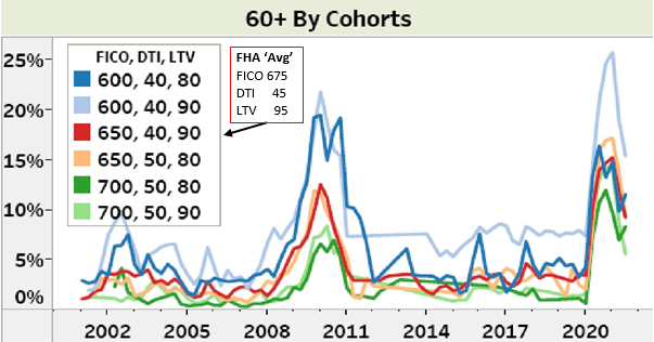
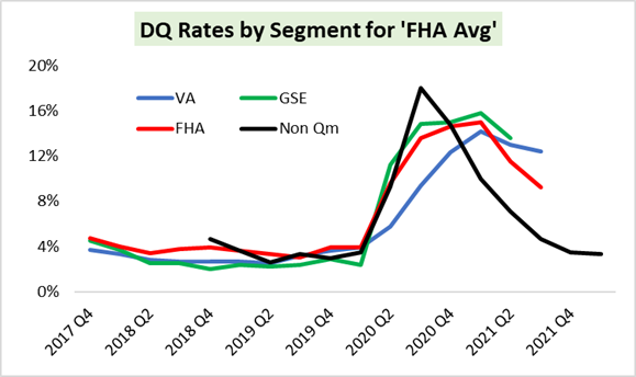
Figure 2 extends the time-series graph that compares the ‘FHA Average’ cohort for each of the three federal segments, GSE, VA, FHA, and non-QM. The ‘FHA Average’ cohort is roughly 95 LTV, 680 FICO, 40 DTI for government lending, and about 90 LTV, 680 FICO for non-QM. The results continue to illustrate that the benchmark cohorts perform consistently across market segments.
Figure 2. Delinquency Rates for ‘FHA Average’
Conclusion
The pandemic and the federal response to it are unprecedented in modern times for their impact on the US economy and housing market. Nevertheless, mortgage cohorts performed consistently over the last several years across federal and non-QM segments, increasing confidence in this approach. This stability contrasts with the vastly higher non-performance rates of the subprime and reduced documentation era that resulted from poor lending practices, as we reported in the original study.
This highlights that conscientiously measuring income is essential to consistency.
The S-Curve Archives
-
 Events
At Andrew Davidson & Co., Inc. (AD&Co), our dedication to Diversity, Equity, and Inclusion (DEI) has been a cornerstone of our values. We established our DEI Committee in 2020, following the tragic murder of George Floyd. Despite the evolving landscape, including the recent U.S. Supreme Court decision impacting affirmative action in higher education, we remain steadfast in our commitment to fostering an inclusive environment that strengthens both our employees and the company.
-
 PodcastTune in to Eknath Belbase's interview with Michelle Stepien Breier & Richard Cooperstein as they discuss their latest Pipeline article “Improving Mortgage Data: A Data Exchange for the Mortgage Ecosystem.”
 -
 Events
At the recent AmeriCatalyst ‘Going to Extremes’ Climate, Housing and Finance Leadership Summit, I presented a session on how risks related to weather-related losses impact the housing finance system.
-
 Events
Andy and I recently attended AmeriCatalyst ‘Going to Extremes’ Climate, Housing and Finance Leadership Summit in Washington, D.C., a fantastic conference on all things related to climate risk and the housing ecosystem. While going over all the great speakers and broad expertise represented there would take a novella, I want to connect a few key ideas discussed there to our ongoing efforts in this area.
-
 Products
Andrew Davidson & Co., Inc (AD&Co) is thrilled to announce an expanding relationship with a Third-Party Vendor! AD&Co enjoys working with countless analytical providers to offer our clients seamless solutions and we would like to welcome Milliman M-PIRe™ to the team!
-
 Events
The Federal Home Loan Bank of San Francisco directed the Urban Institute to develop innovative and actionable ideas to close the gap between white and black homeownership rates, which is as wide today as before the Fair Housing Act, enacted 60 years ago. Homeownership is crucial to a fairer society because working and middle-class families most commonly create inter-generational wealth by owning homes with amortizing mortgages.
-
 Events
The Data Foundation of Mortgage Finance
Homeownership is the largest source of wealth accumulation and inter-generational wealth transfer for the working and middle class. However, the non-interest cost of financing is always an obstacle for first-time and low-wealth buyers, and underserved populations.
-
 Thoughts
In this blog post, we used the recently updated Mortgage Market Statistical Annual to examine the dynamics of residential loan origination by state and by market segments and highlight important trends.
-
 Products
Andrew Davidson & Co., Inc. (AD&Co) is pleased to announce the official release of Kinetics v1.10, the latest update to AD&Co’s modular platform for running the AD&Co suite of analytics. This update introduces the Multifamily LoanDynamics Module, the newest way to run Multifamily LoanDynamics Model (LDM). Investors, servicers, insurers and lenders can leverage this new module to better understand the prepayment and credit risk of their multifamily mortgage portfolio.
-
 Events
Andrew Davidson & Co., Inc. (AD&Co) held a webinar on June 8th entitled “Lessons Learned: Insights for Managing the Interest Rate Risk of Banks.” Mickey Storms from our Alliances and Policies team, Alex Levin from our Financial Engineering team and Andrew Davidson were featured speakers.